VFX supervisor Ditch Doy and VFX producer Paula Pope explain the work that went into the second series of the show
Goodbye Kansas Studios delivered 82 shots and 7 assets for the second series of Netflix’s supernatural horror drama Locke and Key, which was released 22 October.
Based on the comic-book series of the same name by Joe Hill and Gabriel Rodríguez, the show follows three young children who discover a number of mysterious keys that can be used to unlock various doors in magical ways. Goodbye Kansas Studios was one of the primary vendors for the production and the team was led by VFX supervisor Ditch Doy and VFX producer Paula Pope.
When the time came to start work on series two, the creative team wanted to invest more time in the concept designs behind the new characters and creatures – after the first series had become known for its distinctive visual style and fantastical elements. Having seen some of the visuals that the Goodbye Kansas Studios team had created previously, they were approached by the Locke and Key team to create concept art across a variety of sequences in season 2, some being horror-related visuals.
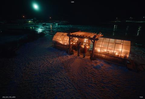
Pope said: “In the second season, the concept art played a huge part in the decision making. We were first approached by the production team where they asked if we could assist them in developing the look of some key sequences quite early in the process. This was to enable them to inform the work on some of their larger asset builds.
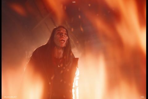
“We really enjoyed working with them to create some fantastic visuals such as a demon character. There was a fair bit of back and forth at this stage to get everything just how they wanted it, but this then developed further into us being asked to work on a sequence based on one of these concepts.”
After creatively completing a plethora of demonic concept art, the Goodbye Kansas Studios team were invited to work on a horror sequence featuring a number of nightmarish mannequins that they themselves had created the initial concept art for. As part of an inception-style nightmare, several characters are forced to traverse a haunted department store inside the mind of another character. It’s during this sequence that these faceless mannequins come to life and attack, developing menacing features as the scene evolves.
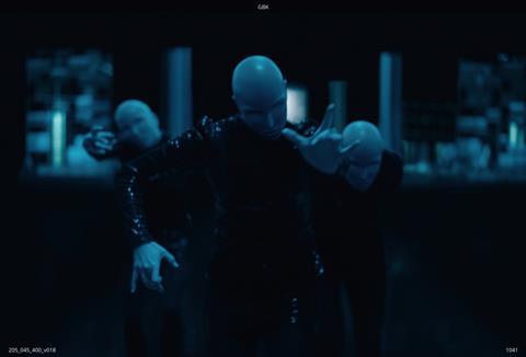
Doy explained: “Because we were involved from the beginning of the process, we essentially got to help design these mannequins and develop the sequence to better inform the actual filming. The VFX Supervisor Wojciech Zelinski liked to involve us and would make sure he checked what we needed from the shoot to create the visuals.
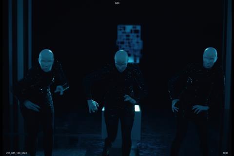
“When it came to shooting the scene, rather than opting for full CG mannequins, they decided to bring in dancers on the set to perform the body moves required and we were then tasked with replacing their heads. Our mannequin head rigs were tailored to connect to our body tracks making it easier for our animators to work on their individual performances.”
The concept for the mannequins changed several times as it was being worked on. There were initially several face scans taken of the actress who played the character, Eden, as the mannequins were all supposed to have her likeness. However, as the sequence evolved, the team decided that it would be creepier if they didn’t have any faces at all.
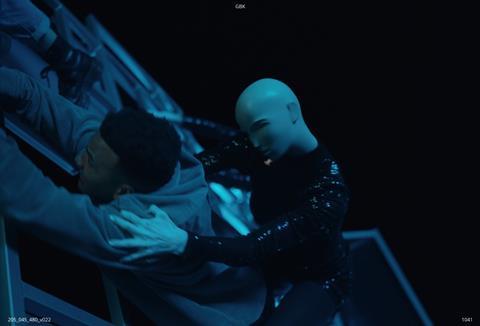
Doy revealed: “The mannequins went from being a sort of photographic replica of the actress to these faceless automata which had a much more sinister feel to them.
“The reference for our mannequins came from early horror films. We were then able to create the jerky head movements to help give the mannequins some creepy and quite unnerving movements. To achieve this, we created our own mini shoot of different head movements, and these initial plates were used as a base to further augment the behaviour. Having that underlying real human motion and then adding secondary animation really worked well for us. However, we did need to toe the line between fantasy and horror since the show is aimed at a younger audience.”
Another key aspect of the work was centred around flames and fire. As the team was working on the mannequin sequence, it was decided that they should be set on fire towards the climax of the scene. As they had already built the mannequins it only stood to reason that they should be the ones to destroy them as well.
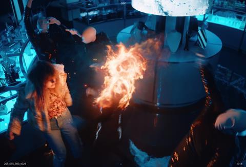
“Burning the mannequins was quite fun,” admitted Doy. “We used Houdini to simulate the fire onto the actor who was wearing two tube lights, one on her chest and another on her back, in order to cast natural light into the scene. This worked out quite well, and as a result, we were awarded the majority of the fire scenes for the series.”
One of the magic keys that play a vital role in the series, referred to as the Matchstick Key, possesses the ability to create and ignite fires. Goodbye Kansas worked on two big scenes that involved the flames created by this key – one of which takes place in a greenhouse that one of the characters sets alight. However, this fire wasn’t meant to be a destructive force, but rather a more playful fire that danced across the room.
Pope said: “The direction we were given for this fire was ‘romantic’, but questions arose as to what constitutes a romantic fire and how best to go about creating it? Our goal was to make it feel slower and more magical as opposed to fast and ferocious. The fire had to travel up a fountain and move slowly across some flower pots to help create the look and feel of a warm, well-lit cosy environment.
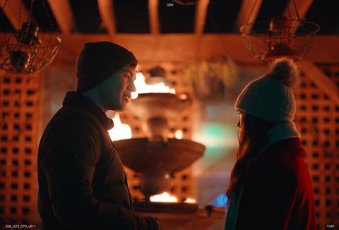
“If the fire was too big or stayed too long on surfaces, the viewer would get the feeling that it could cause the place to burn down. So we made sure to extinguish the fire quickly as it moved across the surface and kept the flame length short to reduce the threat of danger. It was very tricky, but it ended up looking pretty awesome by the end.”
A subsequent scene in episode ten required even more flames, but this time in the style of a blow torch being used on a steel doored vault. Part of the team’s work on this scene required building the vault and the effects of the beam as it melted the door.
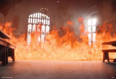
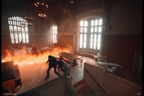
Doy said: “We had to create a plasma torch effect, essentially, which took a bit of back and forth to get the right level of sparks. Since this one key has so many different applications, we couldn’t just reuse the same fires again and again. This was the reasoning behind the romantic fire for the greenhouse scene, an angry wall of flame in episode eight and the welding effect from episode ten. Each one had its own set of challenges and a different look for each which was quite fun.”
“This project has been such a joy for our team – from the concept art, right the way through to the project’s completion. Building that kind of relationship with a client is always quite satisfying and working with people who trust us enough to help the project evolve has been amazing and we can’t wait to see what the future brings.”








No comments yet