


Broadcast decided to illustrate the creative process designers go through when they're pitching channel branding ideas by giving three leading companies a challenge. We asked National Geographic's creative team - headed by Tony Jones - to come up with an idea for a fictional National Geographic channel launch to add to its line-up which would characterise the way the broadcaster would want to take the brand forward.
We asked three leading branding companies to come up with a new look for the channel in two weeks equipped with the same brief plus a National Geographic style guide. They were each required to produce a full screen ident, some bumpers (programme breaks) and an inter-active element. We also asked them to explain how they went about the task and describe why they took the approach they did. National Geographic's creative team then assessed the results.
The client's brief
The panel at National Geographic consisted of Tony Jones, head of creative and communications; Marc Ollington, head of UK marketing and Lee Parker, senior promos producer.
For more than a hundred years the National Geographic Society has explored 'the world and all that is in it'. Eighteen months ago, the channel rebranded with the tagline 'Think Again' to address how its programming has shifted to explore in a more upbeat, contemporary style.
The challenge now is to keep up the momentum of the brand by embracing the way media is consumed in the 21st century. The channel will soon be available across a wide range of media and the brief is to create an extension of the existing brand which can happily bridge the gap between the current channel and all its non-linear platforms - a new channel that could sit comfortably with the current channel, but be clearly differentiated.
Our viewers are a curious bunch and they crave facts. They want to know how the world works and learn something they didn't already know while being entertained. They're mostly male, ABC1 and over 30. Any brand extension should talk to this niche, but also look at lowering the target age and broadening the demographic.
In terms of content our programmes range from Megastructures to Microkillers and, although it's entertaining TV, it's always credible, authoritative and stimulating.
The editorial tone which runs throughout our latest batch of programming is contemporary and innovative and any extension of the brand should convey this innovation.
Company 1 - Turquiose
Gareth Mapp - executive creative director; Ian Humphrey - design director; Rick Plumtree - senior designer;Jonny Singh - designer
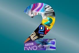
To give the new National Geographic channel a more modern and contemporary attitude which would appeal to a younger audience, we abbreviated the name National Geographic to NG2. We used the numeral two to clearly identify this as the second channel.
To maintain a connection with the main channel's slogan 'Think Again', we created the slogan 'Think Twice' which neatly sums up the second channel. The key element of the National Geographic brand is the famous yellow frame. Using this yellow frame within our logotype for NG2 instantly gave brand recognition. We used a classic bold san serif font for the wordmark, but incorporated a twist by reversing a 2 out of the G. This reinforces the brand slogan 'Think Twice'.
To ensure the new channel is seen very much as part of the National Geographic family of brands, we maintained the key colours of the brand, yellow, grey, black and white.
Creatively the challenge was to give enough information about the content while also giving the channel a contemporary look and feel, which would appeal to its target audience. Our identity suggests a futuristic, virtual channel that allows the analysis and deconstruction of our world.
The idents open with a shot of the famous yellow frame floating in a virtual space, the frame then dynamically deconstructs and fragments into thousands of yellow blocks. These blocks then reassemble to form visuals indicating the channel's key programming strands such as wildlife, machinery, buildings, plants. The presentation system uses the deconstructing blocks as a way of introducing content. The blocks are used as dynamic wipes but also as more subtle backgrounds which can hold text. The yellow frame device acts as a cursor to bring on text.
The purpose of the iTV platform is to give the viewer additional information about the channel's programming and access to news and information via a news feed. We thought it was necessary to keep the interactive design as televisual as possible, so we designed the platform to fit within the lower third of the screen. This way the design doesn't get in the way of the most important thing - the programming.
The verdict:
Graphically we liked the clarity of the logo. It had simplicity and the number 2 punched out of the 'G' was a nice touch. It also occupied a similar footprint to the core channel logo and has a second channel feel. The idents are a bit dark and do not convey the bright contemporary look that we are after. We were also concerned that the use of a graphic style does not represent a brand that is acknowledged for its strong visual imagery. The presentation system is simple and dynamic we liked the way the cursor takes the viewer's eye straight to the logo.
The extended blocks make a virtue of the logo but is possibly a bit too MTV. It's great that the style embraced a younger audience but we need to be careful not to alienate our core viewers. Interactive TV - great in its placement of the menu on the screen and its simplicity - made good use of screen real estate. Overall, this proposal has understood the brand and embraced the new channel idea and how it would extend to a broader audience. Plus they have differentiated the core channel from the new one.
Company 2 - Adams Trainor
Jon Adams - creative director; Miles Christiansen, Yugen Blake - designers
Over the years Nat Geo's style and personality have been reflected through dramatic and arresting visual imagery and narrative. We wanted to take the existing branding and develop it to appeal to a younger, multimedia-savvy audience.
Concept 1: The yellow rectangle is such a strong visual brand identity - it allows a lot to be said about Nat Geo in a simple and understated way. Also, the way that Nat Geo crops and frames images it uses was something we wanted to pick up on.
It started us thinking about the L-shaped cropping tools and chinagraph pencils that are used when working with transparencies and the rectangle safe areas within a camera view finder.
By combining these two elements, we felt that the Nat Geo rectangle could be used to represent a cropping or framing device to draw the viewer's attention towards a particular detail within an image.
In focusing on a detail within the image we would be highlighting that Nat Geo offers a greater insight and understanding than was originally perceived, a flip side or alternative view, making the viewer 'Think Again'.
The viewer would be presented with a still or moving image. In some instances there would be a copy line statement that related to the whole image. A hand would come into shot holding the Nat Geo rectangle and position the frame over a particular area within the picture isolating a more dynamic facet, which is then developed and investigated by means of
the hand pulling that particular framed area full screen. The hand would then flip the image round like a playing card to reveal the Nat Geo brand identity and strap line 'Think Again' on the reverse.
Why the hand? We wanted it to suggest a human interaction between the initial image the viewer sees and what is selected within the rectangle, reflecting the personal experience and connection with the world and also the editors/photographers' endeavour to get to the crux of a subject.
Concept 2: A more left of field approach to the brief, this idea is based on putting Nat Geo right on the spot and in the action. It could be a computer key that launches the viewer into Nat Geo's online world or down on the farm getting dirty.
The Nat Geo rectangle is such a strong brand that it can be placed in the most abstract of locations. It's positioning suggests there is a reason why it is there and that something is going to be investigated.
How the idents might work. With the computer key example, viewers would see a finger come into frame and press the button. They would then be bombarded by a multitude of images flying towards them as if they have unleashed the whole Nat Geo data bank from cyberspace.
With the branding on the brick wall example, the viewer could be presented with a day in the life of an urban street. This could be a high-speed sequence from sunrise to sunset. It suggests Nat Geo's passion for depicting and presenting the real world to the viewer.
The verdict:
We felt this has more of a feeling of an advert promoting the National Geographic Magazine. You would not be aware that this was a second channel complementing the main channel. It's similar to the look we used in our launch nine years ago so we would probably not use that type of imagery again.
We are a contemporary channel that looks at issues that affect us today, this concept struggles to convey any of our current brand values. With the pig example, the viewer would be presented with the initial image for a brief moment before the camera flies at high speed towards the pig and then inside to start a fantastic microscopic journey inside the pig. This represents Nat Geo being at the forefront of bringing new scientific discoveries to their viewers.
Company 3 - Sumners
Designers: Alan O'Brien and Anthony Scott
Our response to the brief was initially governed by the understanding that the new channel's branding had to work alongside the existing main channel's identity. We wanted however to create a brand that was as strong and independent as the current channel.
We began by looking at the name and aimed to get across the investigative, fact-craving nature of the channel by giving the brand a science-like feel with the name nG2.
This not only hints at an element from the periodic table or a mathematical formula but it also gives the brand a contemporary edge in a very simple way, as MTV has done with many of its channels.
In designing the brand identity we focused on two main elements. The first being that the channel would be available across a wide range of media. We believed the design would therefore need to reflect this
digital, futuristic aspect. Secondly, we looked at the different types of programmes to be shown on nG2 which ranged from Megastructures to Microkillers. We wanted the brand to reflect the two ends of this spectrum, from the mechanical to the organic.
The concept: A simple, flat-looking illustration of the world which would mechanically deconstruct itself and reform into the logo nG2. The idea would be for the animation to happen with a mechanical sound effect... like steel screeching together. Although mechanical in appearance and sound, the reconstruction into the channel logo would also have an organic feel, resulting in, we believe, an interesting visual brand. We thought the world could also re-form into other elements like animals or structures before resulting in the logo. The bumper would also appear in a similar way but with the pieces of the logo imploding in from off screen, contorting themselves in order to fit together. The interactive page was designed to match the feel of the full-screen brand and bumper.
The verdict:
The first thing you notice is the colour palette which feels a bit flat. Again, it's graphical and, as mentioned before, stunning imagery and real visuals would be more effective than graphics. We can use footage in a modern and contemporary way if making the channel younger is the objective - see our HD idents on our new high-definition channel.
It is worth noting that on screen the logo would disappear both on screen as a bug but also on bumpers, idents and stings. The use of the abbreviated nG, small n and capital G we weren't sure about, the question we asked was why a capital G? Was it just a design thing or was there thinking behind this that we have missed?
Still they have recognised the different programming strands and the breadth of NGC content and have tried to incorporate this into the design.
Would this logo be recognisable to our regular viewers? It has the border but little else of our branding. Both Turquoise and Sumners both came up with the same ngc2 concept and both attempted to extend the reach of the channel by making it younger. As a bug the 'nG2' text is lost in the border. We would not be able to use the globe in the idents as this is owned by another channel, the conflicting brand elements would confuse the viewer too much.
The winner
In submitting a clear response to our brief, we felt that Turquoise Branding had created a differentiated channel proposition that could sit comfortably next to the core channel. Still, we felt that the graphic language of the proposal fell outside the new channel's target audience. But we felt that further development of this concept would result in a complementary partner to the core channel.


No comments yet