Creative studio provided title sequence and visuals for Fremantle and Misfits Entertainment docuseries
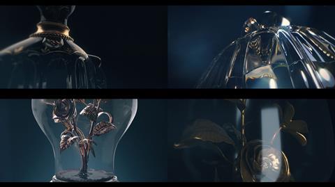
Creative studio Territoy has revealed how it created the title sequence and visuals for docuseries Kingdom Of Dreams.
Produced by Fremantle and Misfits Entertainment, and released on Sky earlier this year, Kingdom Of Dreams chronicles the rise and fall of the global fashion industry during the 1990s and 2010s. It reveals a darker, money-fuelled side to fashion, with major players bidding for global domination.
Territory Studio set out to build a visual tapestry of the narrative within the title sequence, setting the tone for all of the episodic graphics and cutaways. These manifest as a series of fashion and story-driven metaphors, which signify plot points conveyed within the documentary.
The creative was designed, modelled and animated entirely using Maxon Cinema 4D and composited in Adobe After Effects. A mixture of both Autodesk Arnold and Redshift renderers were used to achieve the various levels of detail and high-end finish required. The choice of textures and colour grades of predominantly gold, cream and deep blues were chosen to mirror the contrasting qualities of the production’s theme.
Chris Sharpe, creative director at Territory Studio, said: “When crafting these assets and sequences, it was integral that we collaborated closely with the series and production directors. We maintained this close relationship well into the editing process which led to new opportunities to develop and incorporate the graphics. This ultimately resulted in stronger inflection points used to tie the edit together.”
Key to the development of these assets was finding key story elements from which to draw inspiration, leading to an in-depth look into the style and development. Some of the images are recognisable fashion items and others are slightly more discrete. However, all of them contain deeper sub-text related to the plot.
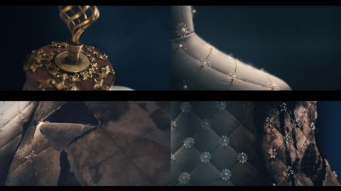
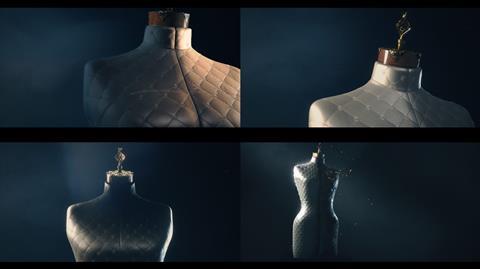
For example, the mannequin is central to the title sequence and the documentary series as a whole. Territory used this design to symbolise the juxtaposition of the fashion industry’s evolution. In its first conception, viewers are introduced to its highly decorative and bejewelled facade. At its conclusion the mannequin is halved, its right side damaged and distressed, revealing the darker influences at play.
Territory added a rendition of Christian Dior’s iconic Diorissimo perfume bottle to represent Bernard Arnault’s ruthless acquisition of the Boussac Saint-Freres textile conglomerate (which at the time included Dior). The nine-thousand employees laid off are visualised as blood, spoiling the content. In addition, the title sequence contains the renowned Gucci bamboo handbag, famously worn by Princess Diana, evoking both the handbag wars of the late 90s and a boom in black market sales of luxury goods. Revenue of which was spuriously linked with funding of the 9/11 terror attacks.
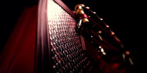
Sharpe added: “There is a lot of fine detail behind the events depicted in the series and we had to find inventive ways to represent them. For example, during the acquisition of Gucci, Pinault is depicted as a much-needed ‘white knight’. As the story unfolds, it proves to be a damming reflection on Arnault’s retrospective actions, proving he, once a ‘white knight’ himself, has turned dark. This twist is reflected in the episode through a series of tailored CGI shots, using curated cast light to affect the characteristics of the symbolic knight emblem which adorns the bag.”









No comments yet